From the beginning of time, people have been expressing themselves through visuals. It is very natural for us to pay immediate attention to illustrations and graphics. And in an increasingly noisy digital landscape, marketers must use them to stand out.
“Blogs were one of the earliest forms of social networking where people were writing 1,000 words,” says Dr. William J. Ward, social media professor at Syracuse University. “When we moved to status updates on Facebook, our posts became shorter. Then micro-blogs like Twitter came along and shortened our updates to 140 characters. Now we are even skipping words altogether and moving towards more visual communication with social sharing sites like Pinterest.”
Now, I do believe that blogs, as well as micro-blogging, still have its place and are not going away any time soon. But with the rise of visual networks like Pinterest and Instagram comes an opportunity for marketers to show their creative prowess. A 2012 study by ROI Research found that 44% of respondents are more likely to engage with brands if they post pictures than any other media. We’ve proven that it’s true within Intel communities where as a rule we are seeing substantially higher engagement with posts and status updates that include an image.
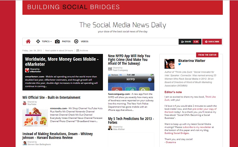
Besides just an image or a video, I would also consider multiple instruments of visual aggregation and curation of information. Paper.li, for example, is just one case of a simple but visual representation of information, curated daily based on the sources you specify (like your Twitter lists). Not only will Paper.li curate the latest and greatest information for you and serve it up in an easy-to-follow visual newspaper-like format, but it will also send an automatic message to your subscribers and a tweet to your Twitter followers (daily or weekly, it’s up to you), thus allowing you to share your digital paper with your communities.
Here is an example of my paper on paper.li.

Our customers are hungry for good content, but any more they expect it to be presented in a snackable and quickly-consumable format. So how should marketers engage their communities through the use of visuals? Here are four types of visual content that cut through the noise.
1. Images
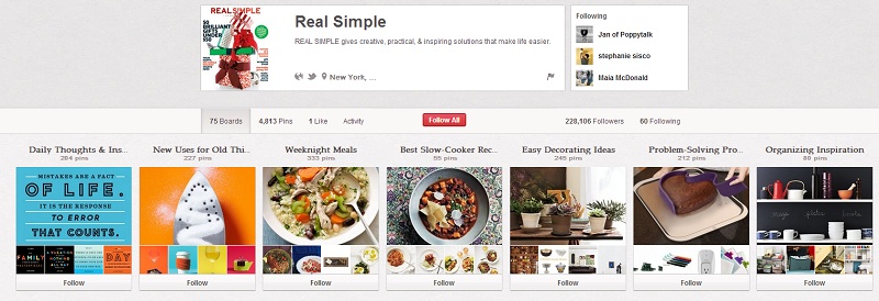
Create custom images to use on multiple networks. You want to do that for two reasons. One, every one of your communities is unique. You don’t want to post every single image across all of your networks (Facebook, Google+, Tumblr, Pinterest, Instagram, etc.). Honor the uniqueness of your communities by posting custom content. Second, each social network requires a different image dimension. If the rectangular images work well on Tumblr, they will be cut off on Facebook to accommodate more of a square dimensions. Also, get creative with your images, play around with them, but ensure that the image clearly articulates your message. And include a little bit of your brand in every one of them; that way they will be instantly recognizable through that bit of consistency. Here’s an example of how Real Simple uses its Pinterest board…

2. Videos/Animations
Video is a highly consumable format. People reach out and search for videos because they prefer to witness whatever they are searching for in real life. A video doesn’t have to be professionally done to solicit emotions and create memories. Even though there is a place for professional brand videos, I believe that more and more brands should be allowing their fans and advocates to tell their own stories, sharetheir own creativity. That is why crowdsourcing is becoming a darling of marketing—it is an authentic way for advocates of a brand to spread their love.
3. Infographics
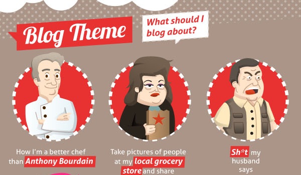
Everyone is looking for great data. We love posts that summarize the data around a specific topic, because it means that we don’t have to spend hours compiling it ourselves. But what’s even more attractive to us is the data compiled in one place visually; hence the popularity of infographics. The carefully crafted infographic is easy to read and follow, and it is visually appealing. It includes valuable information and it tells a story. For example, ProBlogger posted an infographic for beginning bloggers. Here’s a peek at part of it.

4. Presentations
SlideShare is among the most popular places for people to search for great content. Slideshare made PowerPoint presentations sexy again. A well-done presentation is an opportunity for any marketer to not only share her knowledge, but to showcase her creativity as well. Here’s an example of a noteworthy SlideShare presentation.
There are other ways to capture the attention of your audiences through the use of visuals. We’ll stop at these, but we would like to know—what were the most creative marketing visual executions you have ever seen? Originally posted on MarketingProfs
