Have you ever experienced a conflicting but magical response to a piece of brand marketing that thoroughly confuses you as to whether to love or hate what you see before you?
If you are scratching your head, thinking “What in the world is she talking about?” then your answer is probably no.
It’s not surprising. This feeling of wonderful confusion is very rare, it is like an elusive unicorn. That is because most brands don’t have the guts to elicit one.
Let me explain.
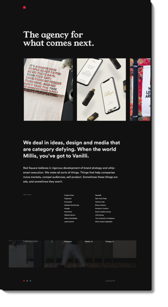
This week I was looking at different creative agencies to help me with the web design. One that was recommended to me by a dear friend, called Red Square Agency, stood out. My immediate reaction: I love clean design, sharp copy, and use of colors! Followed by my second, and equally strong reaction: I hate that I can’t click on anything! That’s right! The only clickable links are the Contact links. Nothing else. It is just one page that allows you to scroll through some sample work without zero opportunity to click on it and see a more detailed portfolio. I was sitting at my desk for literally 5 minutes scrolling up and down and swiping left and right, totally flabbergasted by the fact that that was all I got to see. By the time 5 minutes were up, I was screaming inside.
What the hell?
Who do these guys think they are?
Are they so cool and trendy that they don’t need to display their portfolio anymore?
What kind of marketing is this? Are they going to leave me hanging?

But I loved it all the same. Clean, sleek, simple. Leaves you curious, leaves you wanting more, leaves you strangely satisfied. A totally bizarre behavior, yet a hundred percent human behavior. So what did I do? I filled out their contact form.
And the next day I got to vent to the agency’s CEO, a lovely gentleman by the name of Rich Sullivan. Rich smiled and informed me that since they switched to this approach a year ago, they didn’t lose a single customer because of it and that, in fact, the site is as effective (if not more so) as their old one that displayed their portfolio in detail. And no wonder! Who wouldn’t want to know what’s behind the mystery of the one-page site?
But you have to have confidence and guts to market this way. It’s not easy. And it’s not for everybody. It has to hit the right note with the right audience. It has to work, that balance, the right mixture of strong feelings that don’t accidentally go the wrong way.
It could be an ad that doesn’t show much, doesn’t say much, but elicits a sense of FOMO and makes you think: “Did I miss something important?”
Or a piece of creative that is so beautiful and different that it makes us slow down, stop, and look… for a long time…. make us think for a minute.
Or a new movie release that never was. [And don’t tell me I was the only one who was seriously upset that there, in fact, will not be the next installment of the Crocodile Dundee, but loved the cleverness of the campaign execution anyway].
Brilliant marketing isn’t easy. But oftentimes it doesn't happen at all, and not for the lack of desire to try, rather for the lack of courage to go all the way. Click To Tweet


