With over 145 million users, 370,000 new sign-ups a day and 90 million tweets sent out a day, Twitter is becoming a critical platform for sharing information. (FYI – this data is coming straight from Twitter)
Last night I was watching Twitter’s live announced new web interface – new twitter.com. The new and totally revamped architecture focuses on infrastructure and reliability. The new twitter interface is about “Speed! Responsiveness! Discovery! Getting a lot more out of Twitter in less time.” Twitter expectes to roll this out to all their worldwide users in the next several weeks.
Personally I am excited about this improvement. First, let’s look at what’s new.
New Design
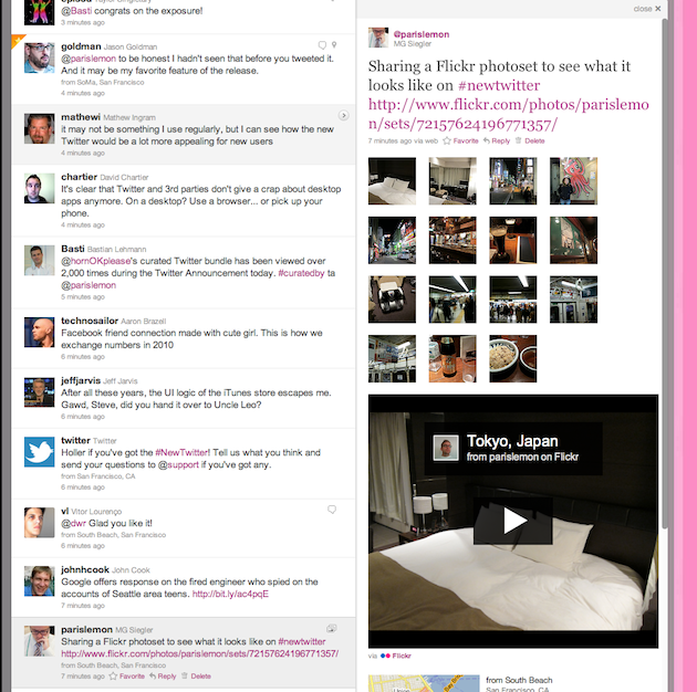
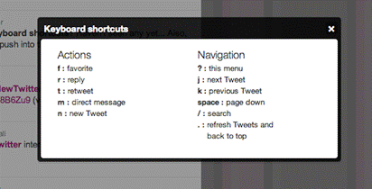
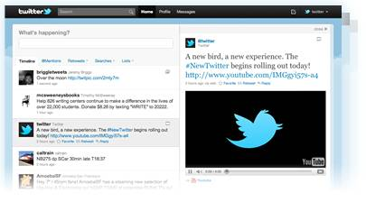
You will now find @mentions, retweets, searches, and lists just above your timeline – creating a single, streamlined view on the left of the screen. On the right, you can see the features you’re familiar with, including whom you recently followed and who recently followed you, favorites, and Trending Topics. Other additional new features: new keyboard shortcuts; tweet and retweet overlay (so that you don’t have to open a new screen); expanded who-to-follow recommendations; tweet filtering by links and location; cleaner look, etc.
Ability to View Media
It will now be easy to see embedded photos and videos directly on Twitter, thanks to 16 partners: Dailybooth, DeviantArt, Etsy, Flickr, Justin.TV, Kickstarter, Kiva, Photozou, Plixi, Twitgoo, TwitPic, Twitvid, USTREAM, Vimeo, Yfrog, and YouTube.
Discovering Related Content
When you click a Tweet, the details pane shows additional information related to the author or subject. Depending on the Tweet’s content, you may see: @replies, other Tweets by that same user, a map of where a geotagged tweet was sent from, and more.
Enhanced Profiles
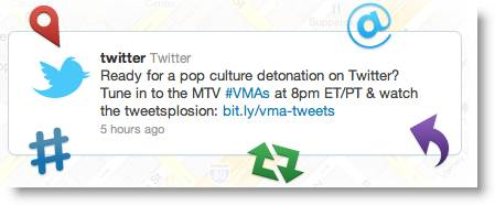
You can click a @username to see a mini profile without navigating from the page, which provides quick access to account information, including bio and recent tweets. The profile page is now supposed to be more about identity. The picture is bigger, the bio is more prominent.
So this raised a number of questions:
- Is Twitter becoming another Facebook? No. Twitter founders were adamant about the fact that Twitter is a real-time information network, not a social network.
- Is this the end of third-party application? It seems to be. Many of best features of Twitter clients like Tweetie, Seesmic Desktop, TweetDeck, etc. are now becoming a part of the default Twitter interface.
- Is mobile still critical for the future? Absolutely! Since the beginning of the year Twitter users on mobile were up 250%. 16% of new users are starting on mobile.
So is this a BIG DEAL? I absolutely think so!
- First, it will be easier for users to engage through the interface and will result in retaining and potential growth of active users.
- Second, the next logical step for Twitter is to roll out brand-owned verified pages, and when that happens I expect that they will have expanded functionality as well as customization flexibility. So this move sets a great stage for that, as well as creates better and more meaningful engagement environment among brands and their customers.
- Third, it created a richer user experience and makes Twitter a more attractive destination for original media.
Some cool new Twitter features (curtesy of TechCrunch) are:
- Tweet and retweet overlay – now you don’t have to open another page to tweet.
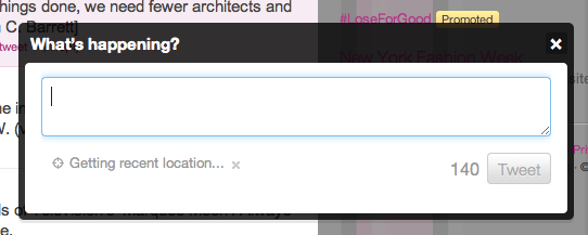
- Keyboard shotcuts (love this!)
- Actual real names appear right next to their Twitter user name/handle
- Ability to filter tweets by tweets with links and geolocation
- Extended ‘who to follow’ recommendations
- You can upload the entire Flickr album and it’ll show as thumnails on the right
